

 On my Front Cover I adhered to quite a few conventions. My masthead adhered to convention as it was positioned at the top of the page, occupying the entire width of it and sat behind the models head, which was a convention I was very keen to follow. I also adhered to convention by having my model look directly into camera, and pose with a genre appropriate prop. I feel this works really well, and represents my genre well. I also adhered to the convention of having a banner across the top of my cover to display information about the magazine; in this case where a free downloadable copy was available. I felt it very important to adhere to this convention, as it would appeal to my target audience. Also, I felt it very important to adhere to the convention of placing cross-media convergence on my front cover, via different social media site logos, again appealing to my target audience.
 However, I did break a couple of conventions on my Front Cover. For example, I felt the convention of studio shots for Front Cover photos needed to be challenged in my magazine, as a way of making my cover more exciting and appealing to younger audience. For this reason, I shot my cover photo on location. I also challenged the convention of black/white front cover colour schemes. Again, I felt this necessary to engage younger audiences, and to create synergy with the cover star, as the shade of pink used was lifted directly from her lipstick.
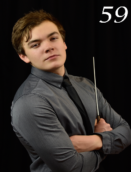
 For my Contents Page I also adhered to a few conventions. Images 44, 59, and 27 all follow convention as the models are looking into camera wearing genre appropriate costumes and using genre appropriate props (44 & 59), and the subject of image 27 is genre related. The texts used on the Contents Page also adhere to convention as they are sans serif fonts
 . I felt this was necessary as it enabled me to appear professional and follow an appropriate convention. I also adhered to the convention of placing an image of the front cover on the contents page, next to the institutional details and subscription box. I felt this was a good convention to adhere to as it made my magazine identifiable to the target audience as a music magazine.
I did challenge a couple of conventions on my Contents Page too. Image 36 breaks convention as the subject is not looking into camera, however I felt this an appropriate convention to break as I wanted to vary the style of shot used, and it also followed the style of music the image is trying to represent
. The colour of the text on the Contents also challenges conventions. Generally, text is black, however I felt that by creating synergy with the Front Cover and challenging the colour convention I would be engaging my target audience more and making the design of the magazine more appealing.


 For my DPS I followed many conventions. I included a drop capital, columns, pull quotes, and a stand first in my article so that the reader could instantly recognise the page for what it was meant to be. I felt that risking challenging these conventions would jar stylistically with the magazine, and make the DPS feel incomplete. I also adhered to the convention of text wrapping in the DPS. I felt that this was a necessary convention to adhere to due to the finished and professional look it gave the article, as well as appropriately filling in white space. The page numbers and institutional details at the bottom of the page also adhere to convention, something I challenged in earlier drafts, but decided to adhere to for my final version.
 I challenged a couple of conventions on my DPS. The pink fade used to highlight the article text breaks convention as the article is usually placed on a solid background not a faded one, normally white, however I wanted to challenge this convention in order to create synergy with the rest of my magazine and also make the design of the page more interesting, drawing readers to it. I also challenged the convention of font colour, by using white and black fonts on the same page. This is something I wanted to do as it highlights the pull quotes, and differentiates between them and the main article, indicating to readers what to read and when.
No comments:
Post a Comment